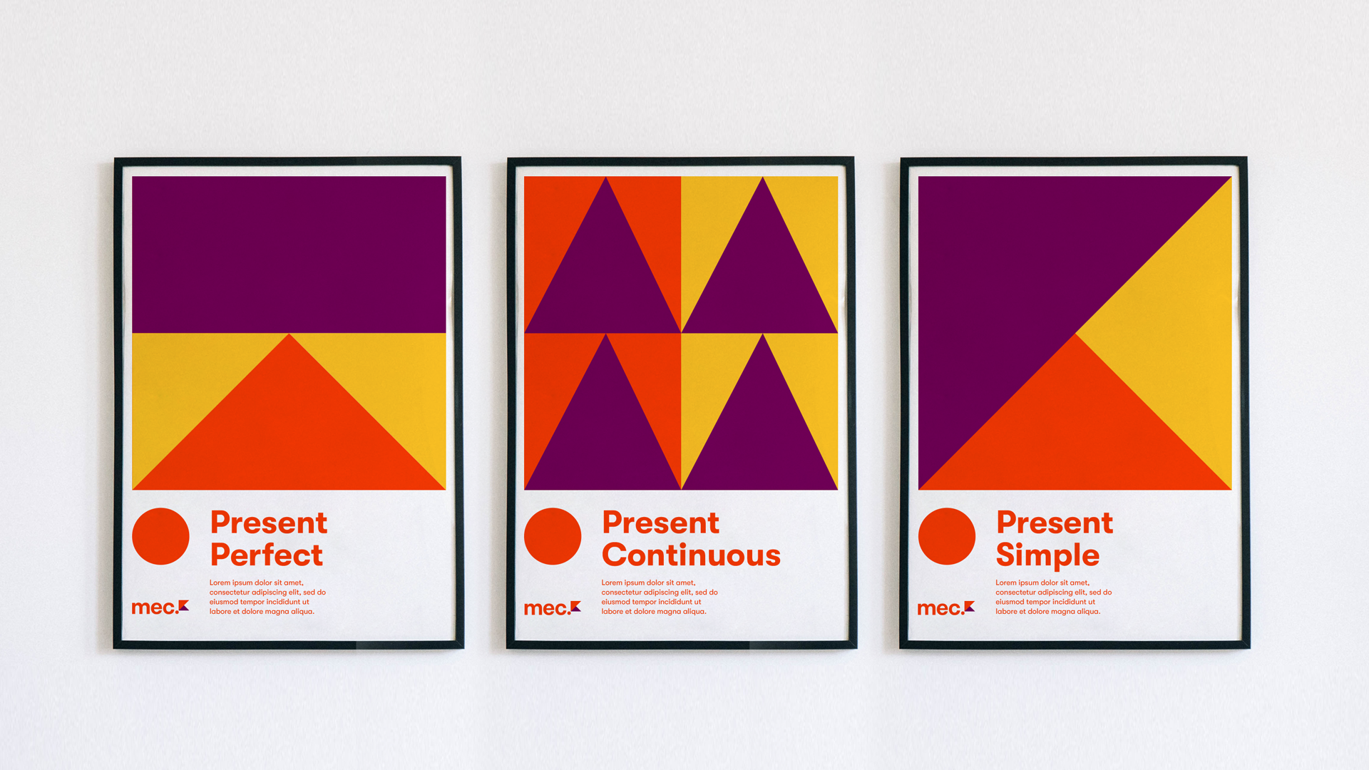
MEC is a brand designed for a bold, personal vision: to make English accessible through a method that embraces how different we all are — in how we learn, how we grow, and how we show up in the world. The methodology was born in the middle of the pandemic, but the brand had to look forward — bright, dynamic, and full of possibility.
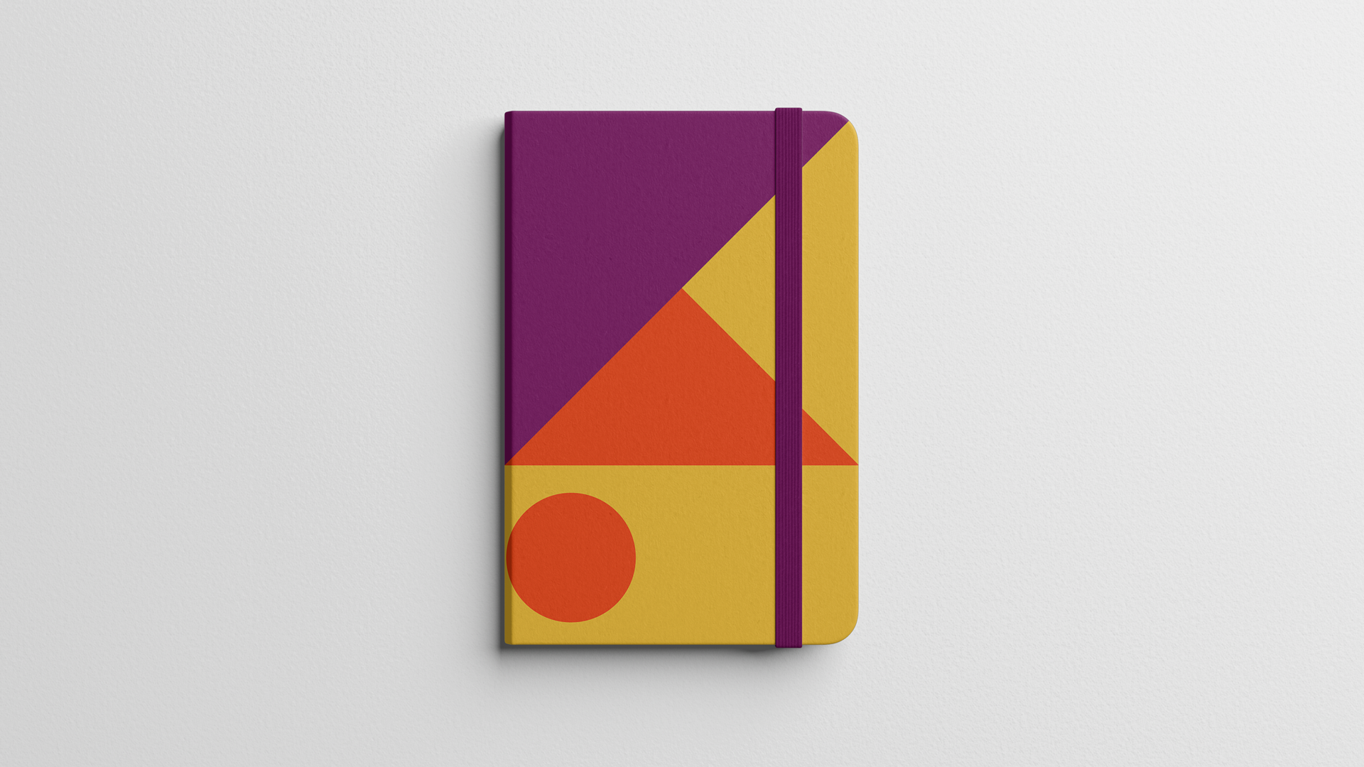
The visual identity is built around a vibrant color palette that reflects the founder’s energetic spirit and optimism. At the core of the system is a series of flag-like symbols — each one unique, like the learners themselves. These flags became a metaphor for progress and self-expression: a way to say "I’ve made it this far, and I’m claiming this as mine."